

Customize Gallery Guide
Customize the right gallery
This guide follows the cards in the Shopify Page Gallery and Product Gallery customization screens. This is a reference for every option on those two screens, including choices, defaults, dependencies, and limitations. Defaults describe newly created galleries; an existing gallery may have different saved values. Start with layout, then sizing, text, and appearance. Click Save to apply changes and check the result on your storefront.
- Page Gallery: go to Galleries → Page, open your gallery, and click Customize. Each page gallery has its own settings.
- Product Gallery: go to Galleries → Products and click Customize. Its shared template styles galleries across your product pages; each product still shows its own assigned content.
- Instagram Feed: go to Galleries → Instagram Feed. It has a separate customization screen; the card order and controls below refer to page and product galleries.
Layout changes do not change your gallery selections, ordering, or product tags. All three layouts support photos; storefront videos require Premium. Basic supports photo page galleries. Advanced adds product galleries and shoppable product tags; Premium also includes those features.
Quick start
- Choose Vertical Grid, Horizontal Carousel, or Portrait Carousel.
- For Vertical Grid or Horizontal Carousel, set rows and photos per row in Size and Spacing. Portrait Carousel fits one row of portrait cards automatically; choose whether to enable Autoplay Videos.
- Set your heading and decide whether to offer customer uploads.
- Save, then check desktop and mobile views on your store.
Gallery Layout
The three layout cards describe how shoppers browse. Vertical Grid and Horizontal Carousel support multiple rows and columns. Portrait Carousel has a single row of portrait cards with a choice of aspect ratios. The layout is shared across desktop, tablet, and mobile.
| Setting | What it does |
|---|---|
| Vertical Grid | Default layout. Content extends down the page. Choose this for a browsable customer-photo page or lookbook. Infinite scroll is optional. |
| Horizontal Carousel | Shoppers browse left and right through pages of content. Each page can have several rows—for example, 8 photos per row and 8 rows. |
| Portrait Carousel | One horizontal row of portrait photos and videos. Short rows are centered; longer rows scroll using swipes, horizontal scrolling, or the chevrons below the cards. Photos stay still. Premium videos can autoplay. Available for photo Page Galleries on Basic and above; Product Galleries require Advanced or Premium. |
| Infinite Scroll | On or Off; default Off. Vertical Grid only. Shoppers start by clicking Load More. When enabled, subsequent content loads as they scroll down. When off, shoppers click Load More for each additional batch. |
| Slideshow Time (seconds) | Horizontal Carousel only. Default: Disabled. Choose 5, 10, 15, 20, 25, 30, 35, 40, 45, 50, 55, or 60 seconds to advance automatically, or Disabled for manual navigation. This changes gallery navigation, not video playback. |
| Card Aspect Ratio | Portrait Carousel only. Choose 9:16 (default), 2:3, or 4:5 for all photo and video cards, across desktop, tablet, and mobile. Media is cropped to fill each card; the original file and pop-up are unchanged. This setting is kept when switching layouts and is disabled for the other layouts. |
| Autoplay Videos | Portrait Carousel only. On or Off; default On. This is a merchant setting. On plays visible videos muted, inline, and looping. Off shows video posters until a shopper clicks to open the video in the existing pop-up. Photos always stay still. There is no visitor-facing Play/Pause button in the carousel. Videos require Premium regardless of this setting. |
Settings for the other layout stay visible but are grayed out and disabled. Their saved values are retained when you switch layouts. Changing layout does not require you to rebuild the gallery.
All layouts open the existing media pop-up when a card is selected, with the same captions, product tags, sharing, and upload options. Only Portrait Carousel supports inline video autoplay. Autoplay pauses when a video moves out of view, the tab is hidden, or a media/upload pop-up opens. Reduced-motion preferences and browser restrictions can prevent autoplay; posters remain clickable.
Size and Spacing
Width, Thumbnail Gap, and Max Photos Limit apply to all three layouts. The six desktop/tablet/mobile row and column controls below apply only to Vertical Grid and Horizontal Carousel. They remain visible but disabled for Portrait Carousel, and their saved values are preserved.
| Setting | What it does |
|---|---|
| Width (%) | Default: 100%. Enter a whole-number percentage, for example 80 for 80%. Sets the gallery width relative to its containing area. Your Shopify section or theme can still limit the available space. |
| Thumbnail Gap | Default: 0.0. A nonnegative percentage spacing value, adjustable in 0.1 steps—not pixels. Increase it to separate tiles. Zero makes tiles adjoining in Vertical Grid and Horizontal Carousel. In Portrait Carousel, zero uses a 16px default gap; a positive value uses the percentage you enter. Large gaps reduce the space available for thumbnails. |
| Max Photos Limit | Enter a whole number of at least 1. Default: blank (“No limit” in the editor). Caps photos and videos across all layouts, independently of rows and columns. For example, a gallery can contain 15 items but show only 4 when this limit is 4. Clear it to show more content. The current storefront fetch has a 5,000-record fallback cap when blank; blank is not a promise of unlimited loading. |
| Number photos per row (Desktop) | Choose 1–12. Default: 6. Sets columns at this screen size. Fewer columns make thumbnails larger within the same gallery width. |
| Number of rows (Desktop) | Choose 1–10. Default: 1. Sets rows per initial grid batch or carousel page at this screen size. Multiply by photos per row for the batch size. |
| Number photos per row (Tablet) | Choose 1–12. Default: 4. Sets columns at this screen size. Fewer columns make thumbnails larger within the same gallery width. |
| Number of rows (Tablet) | Choose 1–10. Default: 1. Sets rows per initial grid batch or carousel page at this screen size. Multiply by photos per row for the batch size. |
| Number photos per row (Mobile) | Choose 1–12. Default: 2. Sets columns at this screen size. Fewer columns make thumbnails larger within the same gallery width. |
| Number of rows (Mobile) | Choose 1–10. Default: 1. Sets rows per initial grid batch or carousel page at this screen size. Multiply by photos per row for the batch size. |
Example: 5 photos per row × 2 rows gives 10 items per desktop batch or carousel page. Mobile can use 2 photos per row × 2 rows for 4 items. The content remains the same; the presentation changes with screen size.
Portrait Carousel sizing: cards use your chosen aspect ratio (9:16 by default, 2:3, or 4:5) and are at most 240px wide (narrowed to 72% of the viewport on very small screens). Photos and videos are cropped to fill the card; the pop-up uses the original media. Card width is not configurable. At the same width, 9:16 is tallest and 4:5 is shortest. Choose a ratio close to your original media to reduce cropping. Increasing gallery width shows more cards rather than enlarging them. The track stays within the containing section.
Make images bigger
For Vertical Grid and Horizontal Carousel, reduce photos per row in this card—for example, from 5 to 3 on desktop. Increase the gallery width if your theme has room. Changing the number of rows changes gallery height, not thumbnail width.
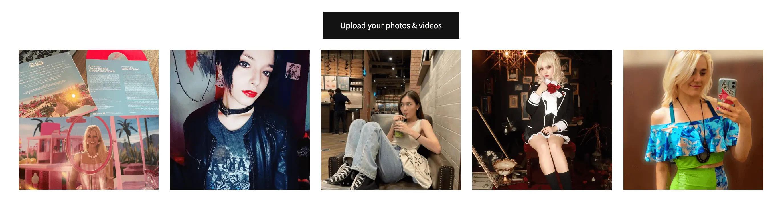
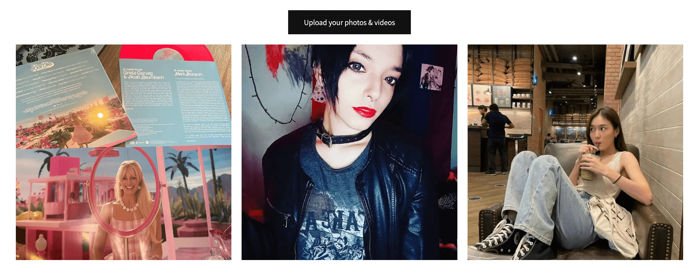
Heading and Text
| Setting | What it does |
|---|---|
| Header Text | Default: “Share your photos with us to be featured!” formatted as an h2 heading. The heading above a populated gallery. Clear it if you do not want a heading. Existing formatted headings can contain HTML, such as an h2 tag. |
| Header Text Alignment | Default: center. Aligns the heading left, center, or right. It does not set the upload button alignment. |
| Use Website Font | On or Off; default On. Uses the font inherited from your storefront theme. Leave this on to match the rest of your store. |
| Font | Default: blank. A custom font-family value. Applies when Use Website Font is off; the font must already be available on your store. Leaving it blank uses the theme font. |
| Font Size | Default: 16 pixels; enter a whole-number size. Sets the gallery text size. Leave blank to use the theme size. |
| SHOP THIS LOOK Text | Default: “SHOP THIS LOOK”. Maximum 255 characters. The call-to-action text shown on hover for a thumbnail with tagged products. Untagged items show only the hover overlay. Clear it to hide the text on tagged items too. This does not remove assigned products or disable the media pop-up. |
Colors and Hover Appearance
| Setting | What it does |
|---|---|
| Text color | Default: #333333. Sets gallery text color. |
| Hover Background | Default: #FFFFFF; clear for a transparent background. Sets the overlay background when a shopper hovers over a thumbnail. |
| Hover Text | Default: #000000. Sets the text color within the thumbnail hover state. |
| Hover Border | Default: #000000; clear for no visible border. Sets the border color of the hover call-to-action. |
Choose contrasting text and background colors so labels remain readable. Hover effects are most apparent with a mouse; check the touch experience separately on mobile. Upload button colors have their own controls below.
Empty Gallery
| Setting | What it does |
|---|---|
| Hides Gallery If Empty | On or Off; default Off. When on, hides the gallery if it has no displayable content. Keep it off if an empty gallery should still invite uploads. |
| Header Text When Empty | Default: “Share your photos with us to be featured!” formatted as an h2 heading. Maximum 255 characters including markup. The heading shown when the gallery has no displayable content and is not hidden. For example: “Be the first to share your photo.” |
If an empty gallery disappears, check this switch before changing its heading. Also check whether your current plan permits the media in the gallery.
Customize Customer Upload
| Setting | What it does |
|---|---|
| Show Customer Upload Button | On or Off; default On. Shows or hides the upload entry point above the gallery. |
| Customer Upload Element Type | Default: Button. Choose a Button or a text Link. |
| Link color | Default: #428BCA. Sets the link color when using a text link. |
| Alignment | Default: center. Positions the upload entry point left, center, or right. |
| Button Color | Button only. Default: #121212. Sets the background. Clear for a transparent background with a light border. |
| Button Text Color | Button only. Default: #FFFFFF. Sets the text color. Clear to inherit the text color. |
| Button Font Size (in px) | Default: 15 pixels. Sets button text size. Leave blank to use the website default. |
| Vertical Padding (in px) | Default: 9. Space above and below the button text; increase to make the button taller. |
| Horizontal Padding (in px) | Default: 30. Space to the left and right of the button text; increase to make the button wider. |
| Customer Upload Text | Default: “Upload Photo”. Maximum 255 characters. The visible invitation, such as “Share your photo”. This differs from the submit button inside the upload form. |
To remove upload entry points entirely, turn this switch off and turn off the upload button in Customize Pop-up Modal. Save your changes.
These settings customize uploads from a storefront gallery. A shareable Upload Page is configured separately under Upload Pages.
Placeholder Content
Placeholder content is supported for Product Galleries using Vertical Grid or Horizontal Carousel. Portrait Carousel displays assigned content only; its placeholder controls are disabled and saved values are preserved. The Page Gallery editor also shows these controls, but its storefront renderer does not currently supply placeholder content. Do not rely on them to fill a Page Gallery. Placeholders do not create product tags.
| Setting | What it does |
|---|---|
| Use Placeholder Photos | On or Off; default Off. For Product Galleries, enables fallback when assigned content is fewer than the photos-per-row setting for the current screen size, not only when there are zero photos. It is not a way to fill every missing row. |
| Add Photo | Opens the form for adding a custom placeholder. Click an existing placeholder thumbnail to edit it. Custom placeholders are used when Use Placeholder Photos is On and Use Instagram Feed is Off. |
| Use Instagram Feed | On or Off; default Off. For Product Galleries, requires Use Placeholder Photos to be On. When enabled, uses recent connected Instagram feed content instead of custom placeholder photos. Turning it on alone does not enable fallback. Videos still require Premium. |
For product galleries, verify both a product with tagged content and one without it. Fallback images are not evidence that those images have been tagged to that product. If Hides Gallery If Empty is enabled, check the empty storefront state as well.
Content Filter Rules
Filter Username is blank by default (no exclusion). Enter one username, not a comma-separated list. Matching ignores letter case and matches the whole username. It excludes content matching the entered username from the displayed gallery. It is not a search for content to include. Clear it to stop excluding that username. This display filter does not delete the underlying content or its gallery placements.
Customize Pop-up Modal
This is the larger view opened when a shopper clicks a photo or video. It is shared by Vertical Grid, Horizontal Carousel, and Portrait Carousel.
| Setting | What it does |
|---|---|
| Use Instagram Icon | On or Off; default On. Uses your Instagram icon. Turn it off to show a generic camera icon. |
| Link to Instagram | On or Off; default On. Controls whether the image or username links back to Instagram for Instagram content. |
| Show Customer Upload Button (pop-up) | On or Off; default Off. Shows the upload invitation inside the media pop-up. Independent of the gallery upload button. |
| Customer Upload Button Text | Default: “Upload Photo”. Changes only the invitation inside the media pop-up; visible when its upload switch is on. |
| Show Share on Facebook | On or Off; default On. Shows the Facebook sharing option in the media pop-up. Does not connect an account or import content. |
| Show Share on Twitter | On or Off; default On. Shows the Twitter sharing option in the media pop-up. Does not connect an account or import content. |
| Show Share on Pinterest | On or Off; default On. Shows the Pinterest sharing option in the media pop-up. Does not connect an account or import content. |
| Show Caption | On or Off; default On. Shows or hides the selected item’s caption. |
| Show shoppable products | On or Off; default On. Shows or hides its tagged product links. Product tagging requires Advanced or Premium; this switch does not create tags. |
| In This Look Text | Default: “In This Look”. Maximum 255 characters. Changes the heading above the tagged products. |
Hiding captions or product links changes their presentation; it does not erase captions or remove product tags.
Customize Customer Uploads Form
| Setting | What it does |
|---|---|
| Username Field — Show Field? | On or Off; default On. Shows the username input in the upload form. |
| Username Field — Required Field? | On or Off; default Off. Requires the customer to complete the username input. Keep Show Field on when requiring it. |
| Email Field — Show Field? | On or Off; default On. Shows the email input in the upload form. |
| Email Field — Required Field? | On or Off; default Off. Requires the customer to complete the email input. Keep Show Field on when requiring it. |
| Caption Field — Show Field? | On or Off; default On. Shows the caption input in the upload form. |
| Caption Field — Required Field? | On or Off; default Off. Requires the customer to complete the caption input. Keep Show Field on when requiring it. |
| Upload Instruction | Default: “Drop files here or click to upload”. Explains what customers should submit. |
| Terms and Conditions | Default: an agreement sentence linking to Socialphotos terms. The terms presented with the upload. Preserve the link to Socialphotos terms when customizing this text. |
| Username | Default: “Username”. Changes the visible field label. For example, use “Full Name” to collect a name instead of an Instagram handle; this does not authenticate an Instagram account. |
| Username Placeholder | Default: “Enter username...”. Example text inside the empty username field. It is not a submitted answer and does not replace the label. |
| Default: “Email”. Changes the visible field label. You can translate this label. Changing it does not change whether the field is required. | |
| Email Placeholder | Default: “Enter email...”. Example text inside the empty email field. It is not a submitted answer and does not replace the label. |
| Caption | Default: “Caption”. Changes the visible field label. You can translate this label. Changing it does not change whether the field is required. |
| Caption Placeholder | Default: “Enter caption...”. Example text inside the empty caption field. It is not a submitted answer and does not replace the label. |
| Submit Button | Default: “Submit”. The label on the button that submits the upload form. |
| Success Message | Default: “Thank you for your submission!”. Confirmation shown after a successful upload. It does not mean the submission has been published to a gallery. |
| Success Color | Default: #727cf5. Color of the success checkmark and message, independent of the gallery and upload button colors. |
Socialphotos terms link: https://socialphotosapp.com/terms. Gallery headings, upload-entry text, and form labels are separate controls; changing one does not change the others.
Save and check your storefront
Use Actions → Save after editing. Save applies this Page Gallery’s settings, or the shared Product Gallery template when editing Product Galleries. Unsaved edits are not applied. Reset to Default asks for confirmation and resets the settings covered by the reset action; it does not remove gallery content. It does not reset every field to the new-gallery defaults listed here, so review the resulting form before making further changes.
- Check desktop and mobile, not just the editor.
- Open a photo or video and check the caption, products, and upload button.
- Check an empty gallery or a product without assigned photos.
- If a setting is grayed out, check the selected layout. If video or product features are missing, check your plan and assigned content.
Starting points
- Full-page customer lookbook: Vertical Grid with optional infinite scroll; fewer columns on mobile.
- A gallery that stays in one section: Horizontal Carousel. Multiple rows are supported; slideshow timing is optional.
- A row of Reels and customer photos: Portrait Carousel with Autoplay Videos on (Premium for videos). Leave Thumbnail Gap at zero for its 16px default spacing.
- An 8 × 8 carousel: set desktop photos per row and rows to 8. Choose smaller mobile values so images remain useful on a phone.
Can this gallery meet my needs?
Use these answers together with the option reference. These capabilities apply to the current Shopify Page and Product Gallery templates; they do not describe future layouts or the separate Instagram Feed editor.
- Can I have a multi-row carousel, such as 8 × 8?
- Yes. Select Horizontal Carousel, then set desktop photos per row to 8 and rows to 8. Tablet and mobile can use different counts. The same selected layout applies across all three screen sizes.
- Can desktop use a carousel while mobile uses a vertical grid?
- There is no separate layout selector per device. Vertical Grid and Horizontal Carousel allow different row and column counts by device. Portrait Carousel automatically fits its single row to the available width.
- Can I show a row of portrait videos that automatically play?
- Yes. Choose Portrait Carousel and turn Autoplay Videos on. Videos require Premium; photos may be mixed into the same row and remain still. Turn autoplay off for still video posters that open the video when clicked. Slideshow Time applies only to Horizontal Carousel and does not control video playback.
- Why are the portrait navigation arrows disabled?
- If all displayed items fit, there is nothing to scroll and both arrows are disabled. Otherwise, an arrow disables at its end of the row. Navigation does not loop. If you expected more content, check Max Photos Limit, the username exclusion filter, and whether your plan permits videos.
- Can Portrait Carousel advance automatically, use several rows, or show product cards underneath?
- No. Portrait Carousel uses one row, with manual navigation and optional video autoplay. Product tags remain in the existing pop-up; there is no product-card strip below each thumbnail. Use Horizontal Carousel for multiple rows or timed gallery advancement.
- Can I have a photo gallery without shopping or upload controls?
- Yes. Clear SHOP THIS LOOK Text, turn off Show shoppable products, and turn off both Show Customer Upload Button switches. The photo still opens in the media pop-up.
- Can customers upload without an Instagram account?
- Yes. Gallery uploads use the customer upload form. Username is a text field, not an Instagram login. Rename it Full Name or hide it, and choose whether email and caption are required.
- Can I translate the gallery?
- You can edit headings, calls to action, product heading, upload instructions, terms, field labels, placeholders, submit label, and success message. These are saved text values, not automatic multilingual translation or a language selector.
- Can I share an upload destination outside my storefront?
- Use Upload Pages for a dedicated shareable upload page. The controls in this guide affect gallery upload forms; they do not configure Upload Pages.
- Do customization settings select content or automatically tag products?
- No. Curate gallery content and product assignments separately. The username exclusion filter changes displayed content; layout, colors, and text do not create assignments. Product links require Advanced or Premium and existing product tags.
Advanced: Standalone upload button
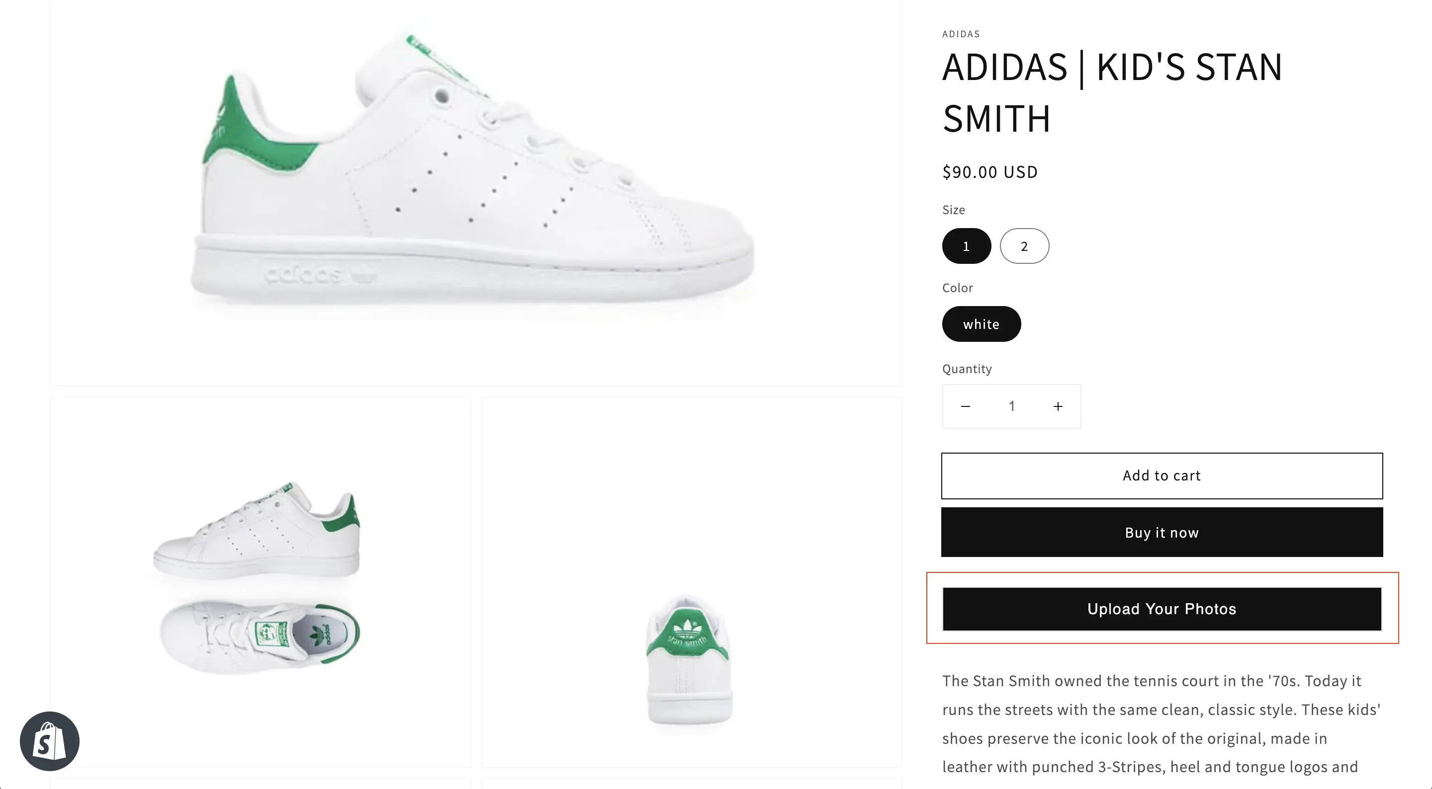
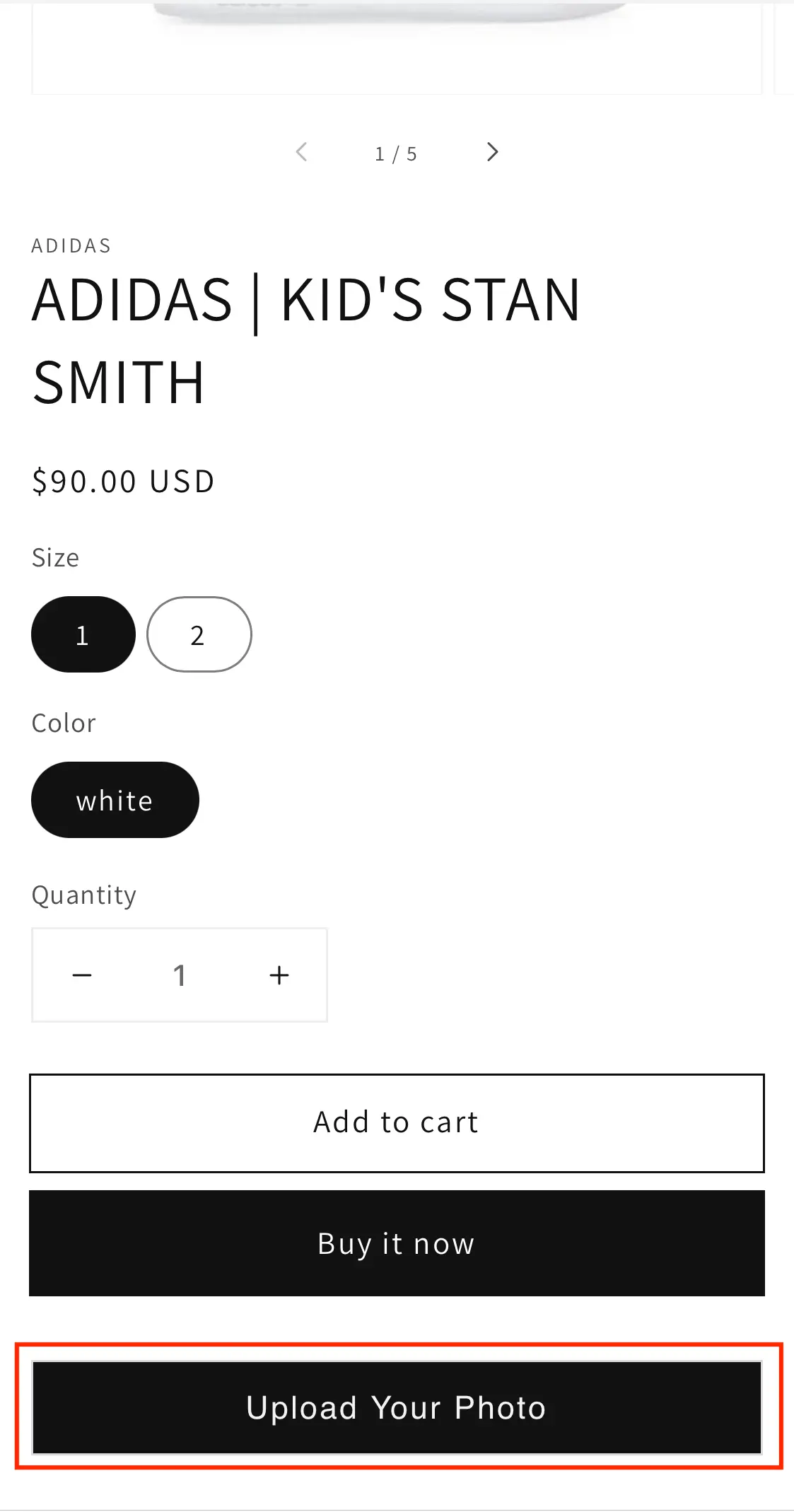
You can create a standalone upload button and place it anywhere on your store. This is useful if you want a single upload button reused across multiple pages.
Example: Desktop
Example: Mobile
Steps
- Create a new UGC Page Gallery.
- Name it Upload Button ONLY.
- Click Customize and clear: Header Text and Header Text When Empty.
- Keep Hides Gallery If Empty off and placeholder content off. Turn Show Customer Upload Button on, choose Button or Link, and give it visible Customer Upload Text.
- Do not add photos to this gallery. Save and add its Page Gallery block to your store.
Advanced: Upload button underneath a gallery
By default, the upload button appears above the thumbnails. If you want it underneath, you can stack two galleries on the same page.
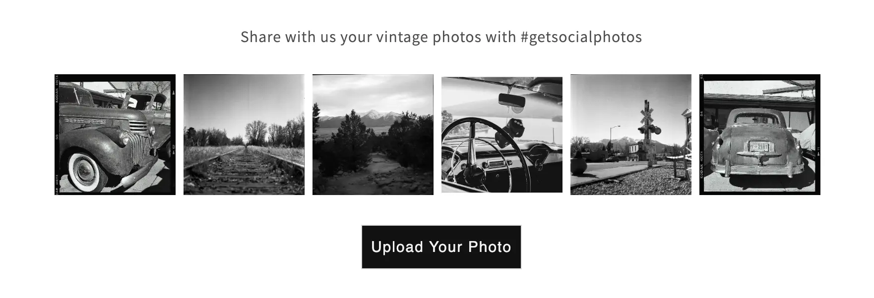
This uses:
- A thumbnails-only Page Gallery (no header and no upload)
- A standalone upload button Page Gallery
1. Create a thumbnails-only Page Gallery
- Create a new Page Gallery and name it Thumbnails Only.
- Customize it and clear: Header Text and Header Text When Empty.
- Turn Show Customer Upload Button off, then add your content and save.
2. Create a standalone upload button
Follow the steps in Standalone Upload Button.
3. Embed both galleries on the same page
Embed both galleries one after another on the same Shopify page. Below is an example of how it can look using two Socialphotos gallery blocks:
            <div class="socialphotos-gallery">


                  <div class="socialphotos-header">
<p>Share with us your vintage photos with #getsocialphotos</p></div>


                  <!-- Thumbnails Only Page Gallery -->


                  <div class="socialphotos-com-gallery slpht-clearfix" data-id="4352267"></div>


                  <!-- Upload Button Page Gallery -->


                  <div class="socialphotos-com-gallery slpht-clearfix" data-id="4352266"></div>


            </div>
Advanced: Add custom CSS to your gallery
You can add custom CSS to any Socialphotos app block — Page Gallery, Product Gallery, Instagram Post Gallery, or Instagram Hashtag Gallery — directly from the Shopify theme editor. This lets you change the look of the gallery — for example, round the corners of the thumbnails, add gaps between images, change the overlay color, or hide the "Shop This Look" call-to-action — without editing your theme code.

Where to find the Custom CSS field
- In your Shopify admin, go to Online Store → Themes → Customize.
- Open the page where you added any Socialphotos app block (Page Gallery, Product Gallery, Instagram Post Gallery, or Instagram Hashtag Gallery).
- Click the app block in the left sidebar.
- The Custom CSS field appears in the block settings on the right.
How to write the CSS
Wrap your CSS in <style> tags. The field accepts up to 50 KB of content.
Example: Add rounded corners to thumbnails
Paste this into the Custom CSS field to give every thumbnail a 12px corner radius:
<style>
  .socialphotos-com-gallery .slpht-thumbnail {
    border-radius: 12px;
    overflow: hidden;
  }
</style>
Tweak 12px to taste — try 8px for a subtle curve or 20px for a more pronounced one.
The overflow: hidden is important: it clips the image, overlay, and "Shop This Look" button so they all follow the rounded shape.
Example: Add gaps between thumbnails
<style>
  .socialphotos-com-gallery .slpht-thumbnail {
    border-radius: 12px;
    overflow: hidden;
  }
  .socialphotos-com-gallery .spw-thumbnails {
    gap: 8px;
  }
</style>
Common CSS selectors
Useful selectors when targeting parts of the gallery:
.socialphotos-com-gallery— the outer gallery container..spw-thumbnails— the grid that holds all thumbnails..slpht-thumbnail— a single thumbnail tile (use this for borders, radius, shadows)..socialphotos-view— the image itself, rendered as a background image..spw-thumbnail-overlay— the hover overlay on top of each thumbnail..spw-call-to-action— the "Shop This Look" text on Product Galleries.